My favorite is the man's face. We made ink prints in art one and it was very difficult so i appreciate the intricate detail of his face. I love how all the lines are going away from the center of his face and all of the cut pieces are nearly the same.
My favorite one is the one with the house and the field of flowers. It's definitely a hard process with all details. The contrast between the flowers and the hills behind is really pretty
My favorite one is building with the sunflowers. This is definitely one of the more successful one because it has so much detail such as the effect of the rolling hills. The process seems very time consuming.
My favorite one is the second one with the sunflowers. The details are very clear and I like the appearance of the rolling hills and the flowers. - Molly Wright
These block print pictures look very interesting and I notice that it looks like it has been gone over multiples to portray the darkness and thickness of the photo.
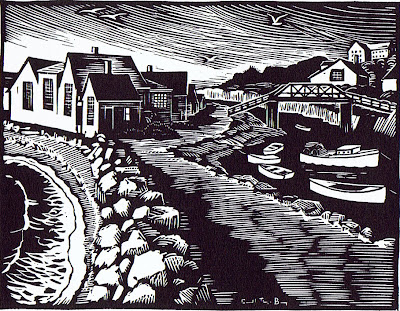
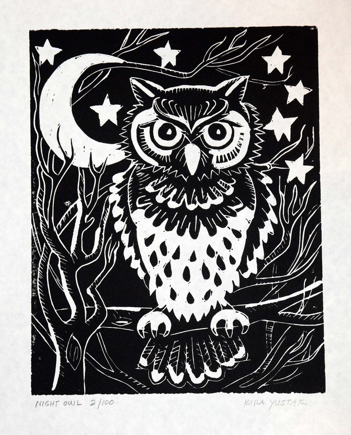
My favorite is the one of the town. I like this one a lot because it is the most detailed out of all of them. The one that is my least is the one of the owl because it seems like a clipart drawing.
i liked the picture of the sunflower field because it has a lot of detail. another thing that makes these more successful is when there's more depth in the picture and this one there was.
I like the picture of the sunflowers because it shows the amount of effort and detail in it. I think this one is more successful than the others because of the amount of depth and small details.
I love the second picture the most. Although it is dark ink, it does not give a gloomy vibe. The scenery is very pretty, and I can't imagine the time it took to create all of the details.
I liked the second picture a lot and the picture of the man's face. It was very interesting. I feel that the artists did a good job of separating dark from light to create depth.
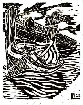
I noticed that some of the pictures used even or random lines to create the shadow with variation. I think the last one is less successful because although it has details on some parts of the barrel, there are a lot white empathy parts seemed to be unfinished.
The first one looks like something out of a hidden images puzzle.The one with the owl doesn't have much contrast between light and dark, the second one you can see the contrast with the hills and it looks more realistic.
My favorite picture is the third one with the place that looks like a "River Town". It catches my eye the most with the shades of the river, and the brick dam leading to the ocean.
The second with the field of flowers is my favorite. It shows lots of details and how the little pavilion really brings out the detail in this picture.
I noticed that these artist use lots of stripes to show darkness and shadows in their pictures. I think the most successful one is the one of the old man. It looks very realistic while using mainly just lines.
I notice that there are lots of patterns involved to keep the print dynamic and the shading was done in a way similar to hatching. I did like how the owl looked different and cleaner that all the others. Miriam


My favorite is the man's face. We made ink prints in art one and it was very difficult so i appreciate the intricate detail of his face. I love how all the lines are going away from the center of his face and all of the cut pieces are nearly the same.
ReplyDeleteMy favorite one is the one with the house and the field of flowers. It's definitely a hard process with all details. The contrast between the flowers and the hills behind is really pretty
ReplyDeleteMy favorite one is building with the sunflowers. This is definitely one of the more successful one because it has so much detail such as the effect of the rolling hills. The process seems very time consuming.
ReplyDeleteMy favorite one is the second one with the sunflowers. The details are very clear and I like the appearance of the rolling hills and the flowers.
ReplyDelete- Molly Wright
These block print pictures look very interesting and I notice that it looks like it has been gone over multiples to portray the darkness and thickness of the photo.
ReplyDeleteMy favorite is the one of the town. I like this one a lot because it is the most detailed out of all of them. The one that is my least is the one of the owl because it seems like a clipart drawing.
ReplyDeletei liked the picture of the sunflower field because it has a lot of detail. another thing that makes these more successful is when there's more depth in the picture and this one there was.
ReplyDeleteI like the picture of the sunflowers because it shows the amount of effort and detail in it. I think this one is more successful than the others because of the amount of depth and small details.
ReplyDeleteI love the second picture the most. Although it is dark ink, it does not give a gloomy vibe. The scenery is very pretty, and I can't imagine the time it took to create all of the details.
ReplyDeleteI liked the second picture a lot and the picture of the man's face. It was very interesting. I feel that the artists did a good job of separating dark from light to create depth.
ReplyDeleteI noticed that some of the pictures used even or random lines to create the shadow with variation. I think the last one is less successful because although it has details on some parts of the barrel, there are a lot white empathy parts seemed to be unfinished.
ReplyDeleteThe first one looks like something out of a hidden images puzzle.The one with the owl doesn't have much contrast between light and dark, the second one you can see the contrast with the hills and it looks more realistic.
ReplyDeleteMy favorite picture is the third one with the place that looks like a "River Town". It catches my eye the most with the shades of the river, and the brick dam leading to the ocean.
ReplyDeleteThe second with the field of flowers is my favorite. It shows lots of details and how the little pavilion really brings out the detail in this picture.
ReplyDeleteLily Wakefield ^^
ReplyDeleteI noticed that these artist use lots of stripes to show darkness and shadows in their pictures. I think the most successful one is the one of the old man. It looks very realistic while using mainly just lines.
ReplyDeleteI notice that there are lots of patterns involved to keep the print dynamic and the shading was done in a way similar to hatching. I did like how the owl looked different and cleaner that all the others.
ReplyDeleteMiriam
ytuidnh349sdsd
ReplyDeletesupreme outlet
golden goose outlet
golden goose outlet
golden goose outlet
golden goose outlet
supreme outlet
golden goose outlet
golden goose outlet
golden goose outlet
golden goose outlet