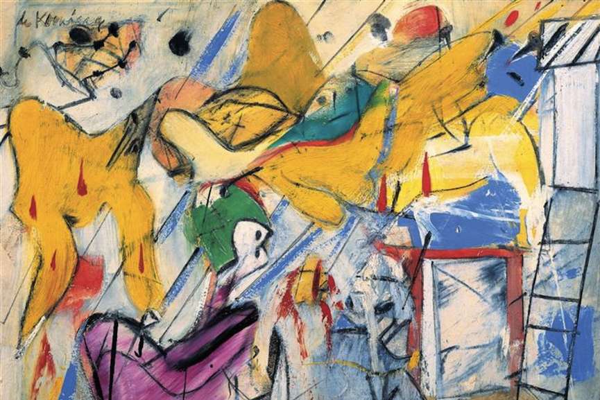
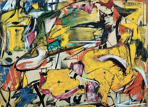
Willem de Kooning was an abstract expressionist painter. Often, there are figures found in his work (first images), but he also painted non-objectively. What do you think?
I think that Willem de Koonings' artwork is very abstract and different. I really like how the non-objective artwork looks because it isn't just a lot of scribbles, but has a meaning behind it.
I like his non objective pieces much better than the creepy faces, I'd rather have the latter ones hanging on my wall than the first two they are scary.
I like the color schemes of the objective paintings, the pinks and reds are pretty. His nonobjective paintings remind me of Picasso's objective paintings because there is so much going on.
The figures painted in the abstract form seem a bit creepy to me, which I like, actually. I think the pictures with people would look better with brighter or darker colors, though. Gabby Lindau
I like the non objective ones way more than the ones with figures on it because its was way less creepy and also the non-objectives paintings reminded me of graffiti which is cool.
de Kooning's art of women is just plain gross, it is what I call "Landfill" art, because I believe that is where it will be be in fifty years when people finally wake up. But this kind of art is maybe what it takes for stupid people to buy it.
From this selection, I really prefer the abstract work - the first one, Gotham News, is my favourite of these three because of his paint treatment. I am just finishing Sebastian Smee's book, The Art of Rivalry, where he talks about the relationship between Pollok and de K - a real eye-opener!


I think that Willem de Koonings' artwork is very abstract and different. I really like how the non-objective artwork looks because it isn't just a lot of scribbles, but has a meaning behind it.
ReplyDeleteI like his non objective pieces much better than the creepy faces, I'd rather have the latter ones hanging on my wall than the first two they are scary.
ReplyDeletei like the third and fourth ones the best. the shapes and colors he uses go together well. I don't really like the first two.
ReplyDeleteI like the color schemes of the objective paintings, the pinks and reds are pretty. His nonobjective paintings remind me of Picasso's objective paintings because there is so much going on.
ReplyDeleteThe figures painted in the abstract form seem a bit creepy to me, which I like, actually. I think the pictures with people would look better with brighter or darker colors, though.
ReplyDeleteGabby Lindau
I like the non objective ones way more than the ones with figures on it because its was way less creepy and also the non-objectives paintings reminded me of graffiti which is cool.
ReplyDeleteI like the non-objective one especially the second to last one and how all the different shapes complement each others. - Abbie Burns
ReplyDeletei like all the contrasts of the colors
ReplyDeletei really like the colors and how the pictures tell a story. - meg hardin
ReplyDeletede Kooning's art of women is just plain gross, it is what I call "Landfill" art, because I believe that is where it will be be in fifty years when people finally wake up. But this kind of art is maybe what it takes for stupid people to buy it.
ReplyDeleteFrom this selection, I really prefer the abstract work - the first one, Gotham News, is my favourite of these three because of his paint treatment. I am just finishing Sebastian Smee's book, The Art of Rivalry, where he talks about the relationship between Pollok and de K - a real eye-opener!
ReplyDelete