 |
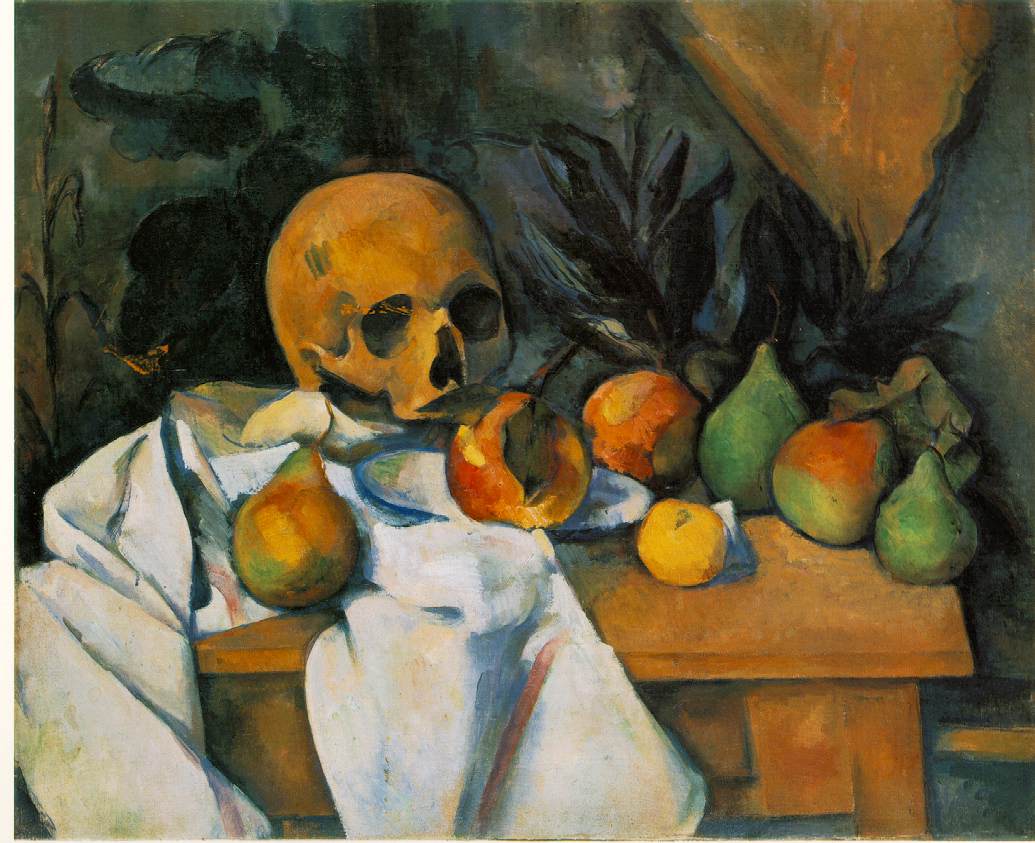
| Paul Cézanne; 1839–1906) was a French artist and Post-Impressionist painter whose work laid the foundations of the transition from the 19th-century conception of artistic endeavour to a new and radically different world of art in the 20th century. Cézanne can be said to form the bridge between late 19th-century Impressionism and the early 20th century's new line of artistic enquiry, Cubism. The line attributed to both Matisse and Picasso that Cézanne "is the father of us all" cannot be easily dismissed. Cézanne's often repetitive, exploratory brushstrokes are highly characteristic and clearly recognizable. He used planes of colour and small brushstrokes that build up to form complex fields. The paintings convey Cézanne's intense study of his subjects. |
Tuesday, December 11, 2012
Art One & Art Two - Cezanne
Subscribe to:
Post Comments (Atom)
Very cool. I really like the coloring in the pear on the far left and the dark background really makes everything else stand out.
ReplyDeleteSara
great colors vivid but dull which captures the essence of the skull and elevate the overall meaning of the painting.
ReplyDeleteCool picture. I like the wall with its tear down the middle. Cezanne was a talented man! Noah L
ReplyDeletethe skull is random but it works:)
ReplyDeleteI like how detailed the coloring is in this picture! -Annalee
ReplyDeletethe skull kinda creeps me out but otherwise it's pretty good
ReplyDelete-Palmer
I really like how realisic this is and the skull looks really cool. Maggie
ReplyDeleteThe background and the white tablecloth thing are really nice and make it look more 3D
ReplyDelete-Amy
I like how the light and dark contrast very vividly.
ReplyDelete-Ashleigh
Wish mine could turn out that good -Nathaniel
ReplyDeleteThe little pears in the corner are green and orange
ReplyDelete-Noah Groover
that is a really cool painting
ReplyDeletejohn gordon
This is somewhat demonic -barron jones
ReplyDeleteThe shading in this is really cool, i like how it looks realistic but it is very smooth and calm. -sydney
ReplyDeleteI like how in the white cloth he uses reds and yellows to help it look more real and 3D.
ReplyDelete-Danielle Bullard
I like how the colors really stand out. It doesn't seem as boring as so many still lifes do.
ReplyDeletei cant draw skulls so that is really impressive. - Grace Ford
ReplyDeletei like how the other colors contrasted, and the bright colors popped.
ReplyDelete-sara lynn slagle :>
everything looks really soft and really defined, except for some parts of the cloth.
ReplyDeleteinstyler ionic styler, canada goose outlet, beats headphones, canada goose outlet, abercrombie and fitch, p90x workout, vans outlet, birkin bag, mac cosmetics, reebok shoes, wedding dresses, ugg outlet, soccer jerseys, soccer shoes, chi flat iron, longchamp, insanity workout, jimmy choo shoes, babyliss pro, roshe run, valentino shoes, nike huarache, nfl jerseys, north face jackets, herve leger, giuseppe zanotti, mont blanc pens, new balance outlet, north face outlet, celine handbags, canada goose outlet, hollister, rolex watches, mcm handbags, ugg soldes, ugg boots, marc jacobs outlet, uggs outlet, nike trainers, bottega veneta, canada goose, asics shoes, ugg, lululemon outlet, ferragamo shoes, ghd, uggs on sale
ReplyDeletecanada goose uk, coach outlet, hollister, swarovski jewelry, canada goose, canada goose pas cher, links of london uk, pandora charms, montre femme, karen millen, converse, moncler, moncler, moncler outlet, louis vuitton canada, uggs canada, ray ban, moncler, vans, louboutin, hollister canada, swarovski uk, timberland shoes, toms outlet, thomas sabo uk, juicy couture outlet, baseball bats, ugg, wedding dress, converse shoes, juicy couture outlet, pandora jewelry, canada goose, pandora uk, hollister clothing, supra shoes, ralph lauren, replica watches, moncler, nike air max, iphone 6 case, gucci, air max, oakley, parajumpers outlet, moncler, lancel, moncler
ReplyDeleteI definitely love this site.
ReplyDeletehttps://prokr2020.cms.webnode.com/
https://www.tumblr.com/blog/prokr2020
https://prokr2020.doodlekit.com/blog
https://www.prokr.net/ksa/jeddah-water-leaks-detection-isolate-companies/